
#the100dayproject : handmade card 70/100 : never give up
happy december to all of you friends! it's hard to believe that it's already the last month of the year, but personally i plan on embracing every minute of it.
before i get to the card for today, i just wanted to give a little shout out and share a post that i put in my instagram stories -

this photo was from a super fun adventure we had last year - jon found this place [that seemed rather sketchy from the outside] where you could take selfies and there were all different holiday scenes celebrating cleveland. this was one of my favorite photos from the day and i liked it even better when i converted it to black and white. i'm so looking forward to being able to go on adventures again - no definite or immediate plans, but it's fun to think about.
but in all seriousness, i couldn't do what i do without the help of this guy. during show season he's right there with me, doing all the heavy lifting and talking me up to anyone and everyone. he's great at feedback and at suggesting ideas for things i would never think of and i love when he keeps me company in the craft castle. he encourages me to spend far too much money on new supplies ["because you need them, obviously" is one of his go-to lines] and he's one of the most incredible humans i've ever met. so it's well deserved that he earns employee of the month. love you babe!
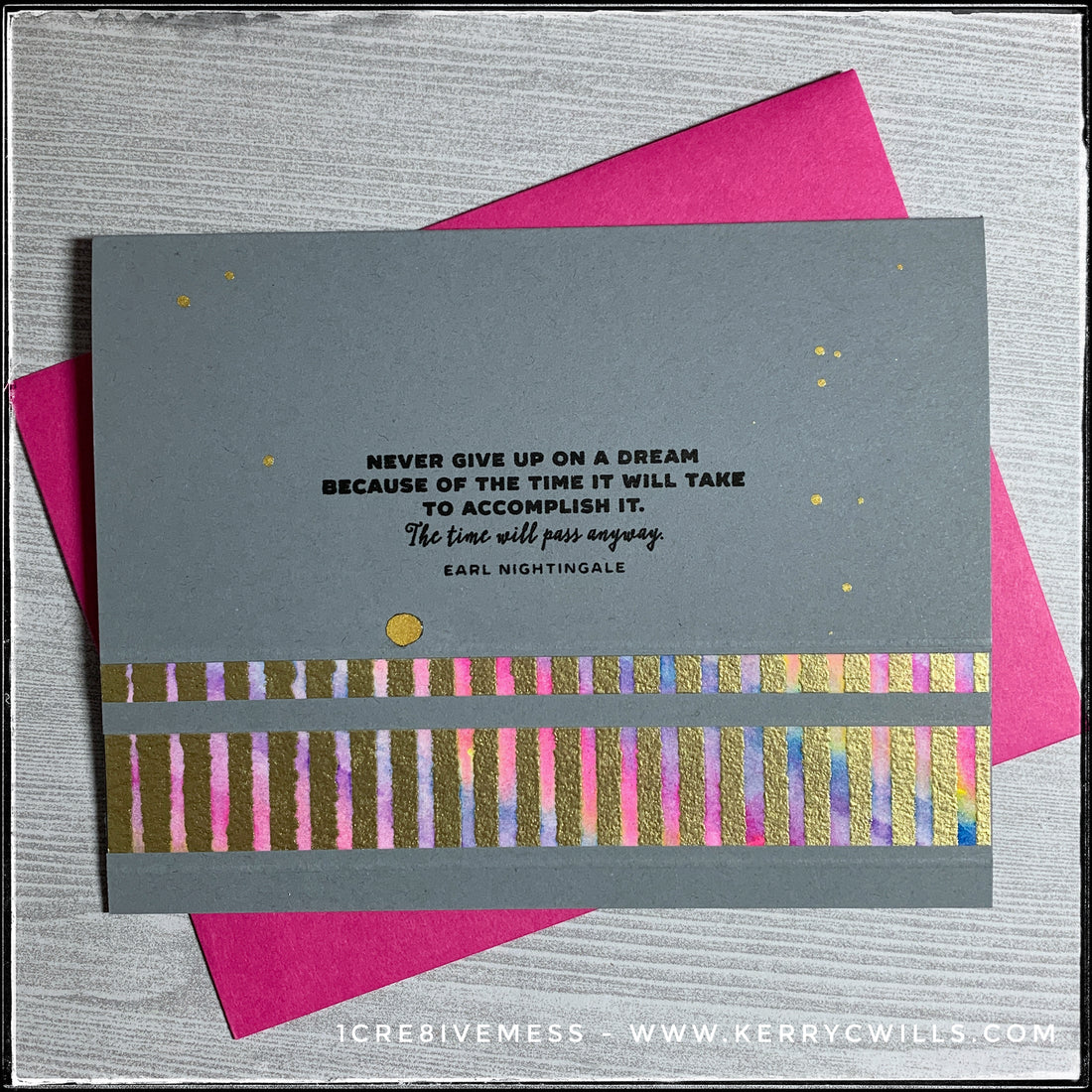
okay...onto the card for today! the inspiration wheel landed on heat embossing and sometimes that intimidates me. however, i decided to try a few different things.

i took one big block of watercolor paper and using a stencil, i swiped embossing ink on the negative spaces. i sprinkled on gold embossing powder and heat set it until it was nice and shiny. then, i haphazardly swiped four colors of zig clean color real brush pens on in a diagonal pattern. i used a bright pink, yellow, bright blue and a purple. once the panel was mostly covered, i spritzed the entire thing with some water, causing the inks to blend. i blotted the extra water off of the embossed areas [which resisted the blend] and let the entire thing dry. once dry, i cut it up into four rectangles, which were then each cut again so that i could create four cards.

i love the texture of the gold - it isn't perfect and while that would normally drive me crazy, i was super inspired by it on the whole panel. [especially because once it's cut up, you can't really tell - until i tell you of course.] but since it wasn't stamped, the lines aren't all the same size or perfect. the ink was smooshed between the lines of the stencil and i just think it looks so fun! there's no rhyme or reason to the color pattern behind it, but using just those four colors actually created so many more blends. and when it's angled in the light - it glistens so brightly and the shine is just beautiful. swoon.
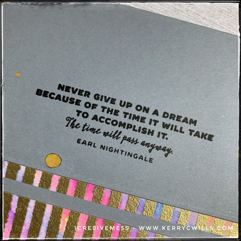
this sentiment is one that i remind myself of quite often because it's just so accurate. time flies - so might as well chase those dreams and kick some ass along the way, right?
to add a little extra detail, i flicked some gold dots of shimmery goodness onto the card front to correlate with the gold stripes on the embossed pattern. i purposely dropped a few larger drops and then a variety of smaller ones. i think it helps bring everything together.
while it's not my normal style, i think it turned out so great! i might have to add this one to the wall display as well. i'll list the others in the online shop over the next couple days, along with a few from this past weekend.
70 days down, just 30 to go. let's rock this last month - what do you say?