#the100dayproject : handmade card 55/100-2 : sweet birthday wishes
Share
hey friends!
after a few [more than slightly rough] shifts at work, i'm happy to report that i made it! i now have a few days off that will be stuffed full of diet coke, good music and all the crafting my little fingers can handle. my to-make list is suuuper long and i'm challenging myself to accomplish as much as possible! i'm thinking i'm going to spend day one making, day two listing and day three making even more! i can't wait to share more and more details over the next few days and posts.
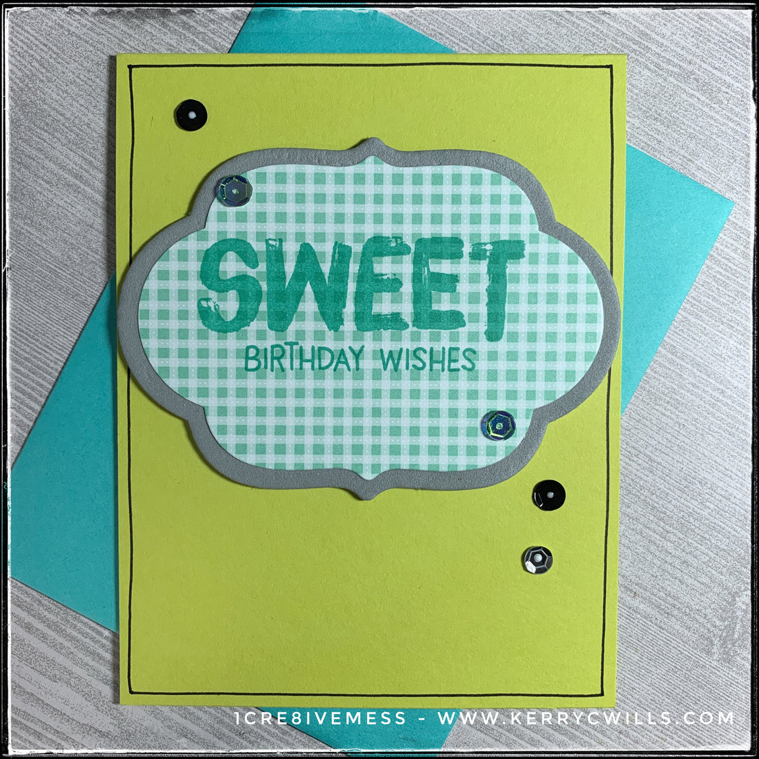
the inspiration wheel's spin for day 55 landed on birthday for the theme of the card. i wanted to incorporate a few elements that i haven't combined before, so i selected a fun, gender-neutral color scheme, a pattern that wasn't too busy and a die-cut shape that i haven't used before [because it's brand new in my stash!]
here's the result:

i love this bright shade of green that forms the card base - it's one of my favorite colors. i just think it's so happy! i paired it with an aqua patterned plaid as well as a darker shade of grey. the label shape in the center of the card was die-cut twice and then stacked together; the grey layer is foam so it's slightly dimensional. using a darker shade of aqua than the pattern, i stamped the sentiment "sweet birthday wishes" near the center of the label. scattered across the card front is a trio of groupings of sequins in shades of black, bright lime green and silver. [side note - they were still slightly wet when i photographed the card and the white dots that are visible in the centers of the sequins will be clear upon drying.]

the word "sweet" is designed to look as though it's been painted on the card front - it's a fun font and pairs well with the rest of the sentiment, "birthday wishes" which is a bit more whimsical. the sequins that are on the label are both a bright shade of lime green which have an incredible reflective quality. as the light moves across them, they change color a bit. so fun!

a thin, hand-drawn black line surrounds the perimeter of the card front and lies beneath the dimensional die-cut. it creates a really nice frame and helps your eyes focus on the main sentiment. it's also purposely not perfectly straight, which is a nice correlation to the wonkyness of the sentiment as well.
birthday cards are so fun for me to make because each person receiving them is different and celebrates in their own way! i think it's important to have a variety of styles and colors available. there's already a handful of options in the birthday collection of the online shop, and i'll have more in the next few days as well.

i'm pretty sure that anyone [and everyone] would appreciate this happy burst of color arriving in their mailbox to help them celebrate their special day!
if there's anything you're itching to see come to the shop, please don't hesitate to drop me a comment below or shoot me a message. i hope you know by now i want to make what you want to send! i know i've said it a bunch, but i'm so excited about what i have coming up - a lot of color, a bunch of happy and a sprinkling of things out of my normal style. it's going to be amazing.
over the weekend of black friday, i'm participating in two online events! i'll be sharing more detailed information as the events get closer, [including an epic online catalog with highlights from all the vendors!], but i encourage you to check out the social media for both, listed below. if you mark yourself as "going" to the events it helps spread the word and then people you know can see the info as well - which is helpful to me and the other talented makers. [just food for thought!]
shop holiday handmade
-facebook
-instagram
virtual holiday makers market
-facebook
-instagram
more tomorrow friends!
