

#the100dayproject : handmade card 25/100-2 : autumn greetings
i don't know about where you live, but where i'm at in ohio - it's really starting to feel like fall weather. when i woke up this morning it was 38 degrees outside and it only got to be about 52 degrees as a high today! brrr! despite being chilly all day, i decided to channel some of the beautiful aspects of fall - the changing colors of leaves specifically - for today's handmade card.
the inspiration wheel landed on monochromatic color scheme and my secondary spin landed on the color orange. i added in two neutrals for the card as well - white as a panel base and brown because i think it's kind of an extension of orange.

the main stamp set i used is one of the first sets i ever purchased from papertrey ink [although now retired] and it's definitely one of my favorites. each tree top has been stamped in a different shade of orange ink and each features a different design; a bird sitting on a branch, clean striped lines, a perfect plaid with an inlaid heart and sprouting leaves with a floating, flying butterfly.
i elected to use my inks from pinkfresh studios for both the tree tops as well as the tree trunks. one of the best things about these inks - aside from the amazing quality - is that they come in families of four per color. they're great for building layers and the colors are so rich and creamy! i am so happy that i invested in the entire set! so the tree tops are the orange family and the trunks are the brown family. if you number the colors 1-4 from lightest to darkest, i used each number with the corresponding number of the opposite color. so the second lightest with the second lightest and the darkest with the darkest and so on.

as for the sentiment, i selected "autumn greetings" from this newer set from mft. i liked the way that the word autumn played off of the color choice for the trees. i inked up the top portion of the stamp with the second lightest color of ink and the bottom portion of the stamp with the darkest color. i stamped it twice so it was a little darker and the colors blended together in an ombre color scheme, almost flawlessly.
to ground the trees a little bit i swiped a watercolor marker below each trunk. i didn't want them to appear to be floating against the white background, so this technique helps ground them a bit. each mark is slightly different, which i think works since each tree is too. since all the stamping is one layer, i like the addition of a mounted layer to give this card some depth.

the white panel is layered on a darker shade of red-orange before being mounted onto the classic orange card base. this card can be used for so many different reasons and that's one of the amazing things about it. thinking of a friend? send this card and say hello. need to write a quick thank you? use this card. miss someone and haven't had time to virtually visit? drop this card in the mail and brighten their mailbox. there's no wrong reason to send some mail, especially handmade mail! plus, i do an actual happy dance every time you support my dreams and shop my catalog, so there's that. wink, wink.
today marks day 25 in the second round of this challenge and if you'll remember that when i began, i shared details about the inspiration wheel i had created and would be using. i ended up adding a couple more topics to the wheel for a total of 18 different options [after i posted but before i began.] i thought it would be cool to create a wheel to showcase the color that corresponded with each day depending upon the theme and now that we're 1/4 of the way through the project, here's what the wheel looks like.
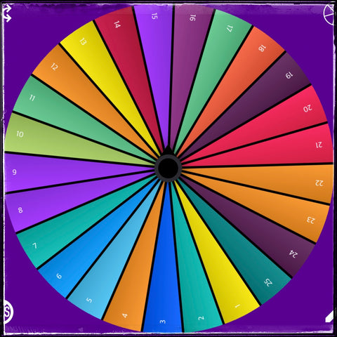
obviously as we get closer to day 100, the wheel wedges will get smaller but i think it will turn into an incredible rainbow for all the topics that i've covered. i haven't hit all the colors yet but i'm confident that i will eventually! plus, it's super fun to track the progress as i go!
25 days down, 75 to go! woot woot!