
#the100dayproject : 77/100
for today's card i knew i wanted to make a thank you card of sorts. i have a handful of people that i could currently send this to and i think everyone can appreciate a good thank you card.
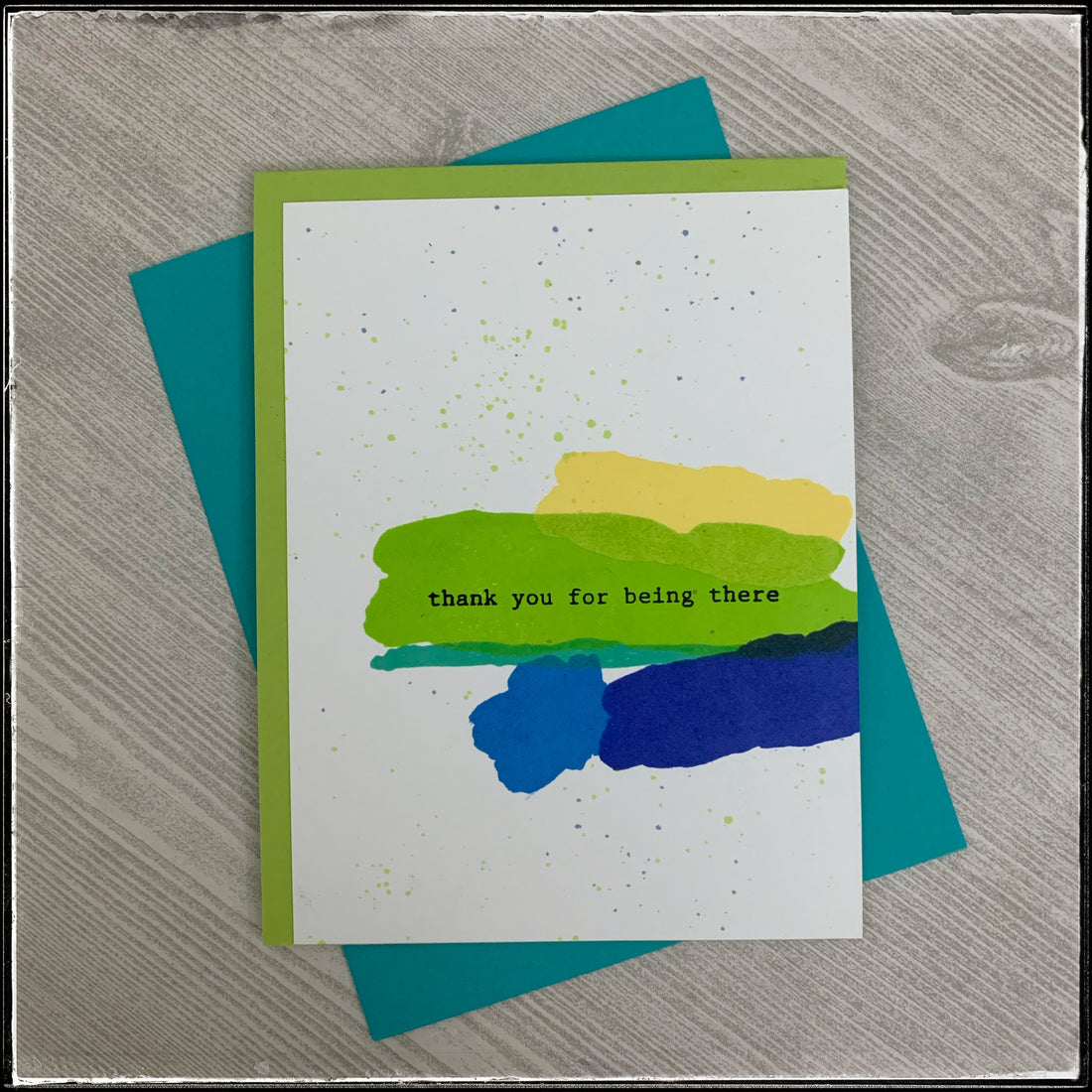
using some of my newer pinkfresh studio inks, i stamped a variety of images designed to look like watercolor brush strokes. i purposely overlapped several of them and i selected shades of yellow, greens and blues.

the blobs of color are near the right side of the front panel and in the middle on the largest section of color, i stamped the sentiment. it's in one of my favorite fonts designed to look like typewriter type and in black ink it reads "thank you for being there"
i aligned the white panel with the right side of the card base, which is a green color, similar to that of the largest block of color.

to add a little more subtle detail to the negative white space, i used the main green and the darker of the blues to flick some ink in a random splatter pattern across the card front. each card is slightly different but i like that aspect of it.

i still can't get over how crisp and cleanly these inks stamp - they're just amazing and i'm so happy i decided to purchase them. plus the color variety is incredible.
these cards will be added to the shop soon and i'm mailing a few of them out as well. i haven't made any one of a kind cards for #mailitmonday in a few weeks, although i have been sending mail. i'm really looking forward to making a handful of new styles and sending them out. of course i'll share details here as well!
here's hoping this is a great week for you!