#the100dayproject : 73/100
Share
it's always entertaining to me when i have an idea in mind, i start to execute it and then i screw it up beyond repair. especially when said idea is for someone else.
that's part of the story behind today's card, which involves a handful of different style elements than my typical go-to.
for example, today was the first time i'm experimenting with creating a slimline card. they've become increasingly more popular with a wide variety of die-cuts catering to the creativity aspect. i don't yet have any of these, but they are on my list! the size of the card is 3.5 by 8.5 and it fits in a standard envelope - but more on that later.

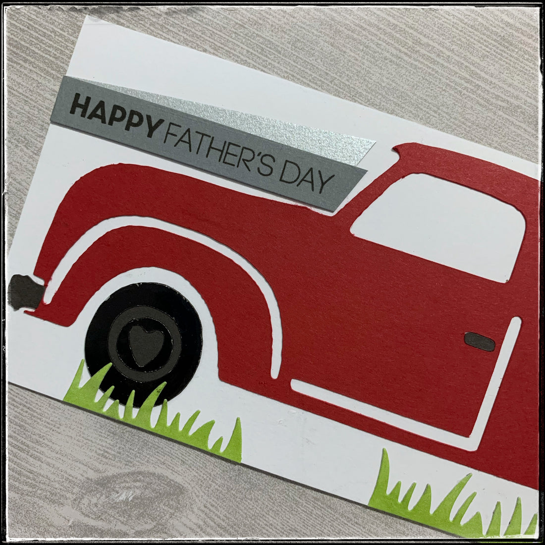
my friend requested a father's day card with a red truck - she sent me an image of the truck and try as i might, i couldn't figure out a way to make it look similar. so instead, i decided to alter the plans a little and create a rustic-country truck. at least that's how i'm describing it.
i used my silhouette to cut the truck, which i altered a little using my designer software. the truck itself is a solid red color, but the front and rear bumpers, car door handle and the inside portion of the wheel wells are charcoal grey. the wheels themselves are a shiny black, as if fresh from the dealer - and one of my favorite details is the fact that the inside detail on the wheel is a heart shape.

under the wheels alongside the bottom of the card panel, i adhered some strips of green grass. they are in small patches, as if the empty spots were flattened under the weight of the car. [i'm telling ya, i put a lot of thought into the story behind this one, haha!]
the sentiment reads "happy father's day" and is stamped on a light grey strip, ending with an angle mirroring the windshield on the car. i paired it with a shiny silver, also an angled strip. [i had plans to put the sentiment under the truck, but due to a minor mishap, i had to change it up a little.]

the entire white panel is layered onto a red card base that matches the color of the car. i did use foam tape, because you know i love it and subtle dimension.
it's a little different than most cards that i make, but i enjoyed the process, as well as learning and adapting to issues i wasn't expecting.
as for the envelope, i could give it to my friend with a standard white business #10 envelope, but what fun would that be? so, i pulled out my envelope board and made my own. i decided black would be a good option and pair nicely with the card, but unless my friend has a white pen like i do, addressing the card would be difficult.
no worries, i had an idea. i die-cut a rectangle out of the red cardstock and adhered it to the front of the envelope. now even if she decides to just hand the card to her recipient, she can at least write their name here and it will be visible.

i purposely made it slightly off center so that if she applies a postage stamp it will even out. and if she doesn't, that's okay - we'll just pretend i wanted it that way. as an added detail, the die-cut has faux stitching because everyone knows how i feel about that! subtle, but so awesome nonetheless.

not shown - is a smaller red rectangle that i die-cut and put on the back so that she could put a return address if it was mailed. and if not, it's just decoration or maybe she can write the year or whatever she wants.
i can't wait to give it to her and i hope that she likes it as much as i enjoyed making it. i think that slimline cards might be making an appearance more often in my creative world - because i really enjoyed this different creative platform.
but that also means i might need to buy more supplies so...off i go to investigate!
