
#the100dayproject : 7/100
one week successfully completed! woot woot!
as i mentioned in yesterday's post, i had selected a color combination but wasn't quite feeling it when i went to create my card. i approached it again today and am happy with the results.

while the colors slightly reminded me of easter eggs, i'm glad that i held off until today. the inspiration for my card actually came from another project that i'm currently working on.
before all this covid-19 business, i was scheduled to be in ventura beach california this week for the craftcation convention. since i obviously couldn't go, i was feeling more than slightly bummed. one of the workshops that i was really looking forward to taking was a bargello class, so last week i treated myself to a kit from this website, that i might now be slightly obsessed with. this is what i ordered and what i'm currently working on - but not in these colors! [i'm waiting to share those details until i have a little more completed - so stay tuned to instagram!]

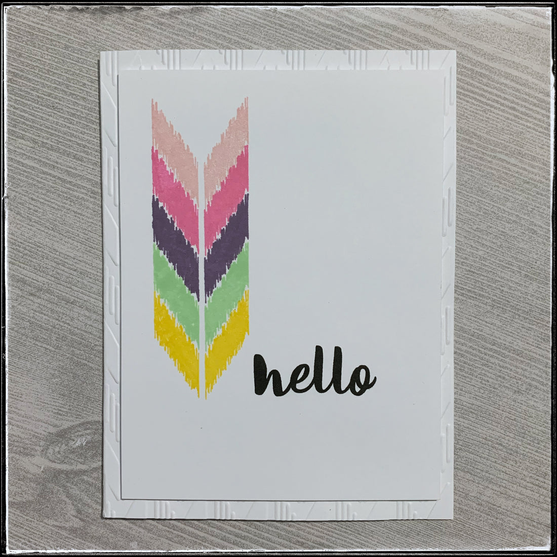
i have this great ikat stamp set from papertrey ink and one of the main images reminded me of the repeating stitches that i'm making while creating my wall hanging. i used it over and over with the colors from the inspiration and added a simple "hello" sentiment.
i felt like it was a little plain and while i was debating what to add, i decided upon some texture. i have an embossing folder that coordinated with the pattern so i ran the card base through my die-cut machine.

i adhered the front panel with foam tape for additional dimension and only then did i realize that in my head i wanted that front panel to have a wider border around the edges. my embossed detail can hardly be seen!
i couldn't do anything about making the panel smaller, but i do think it will be a nice surprise when the recipient of this card opens it up to find a gorgeous texture on the inside!

it's just so fun and surprising. so, even though it isn't as visible as i might like on the front of the card, i still think it works. i'm not always huge on having sentiments or details on the insides of cards [because you can only see them when the card is open] but i do think this came together nicely.

this is another example of a color combo that i never would have selected if not for my swatch book. i often stray away from the purple color and i don't have a real reason why. it was one of the first inks i purchased, but i rarely use it - so i'm grateful for this chance.
the plan is to list all the cards from the past seven days in the shop tomorrow and i'll share the details on instagram when i do. i'm looking forward to a day off and another chance to work on my bargello project.
here's hoping your week is off to a great start too!