#the100dayproject : 48/100
as promised in yesterday's post, today i went back to the color swatches! when siri helped me pick today's swatch number, i wasn't initially thrilled. it's kind of an odd combination of colors, but i decided to roll with it.

stormy sea can look green, blue and grey depending upon what it's near or next to. it's a newer color for me and i haven't used it very often. the rest of the colors i have experience with and i think for the most part that they go together.
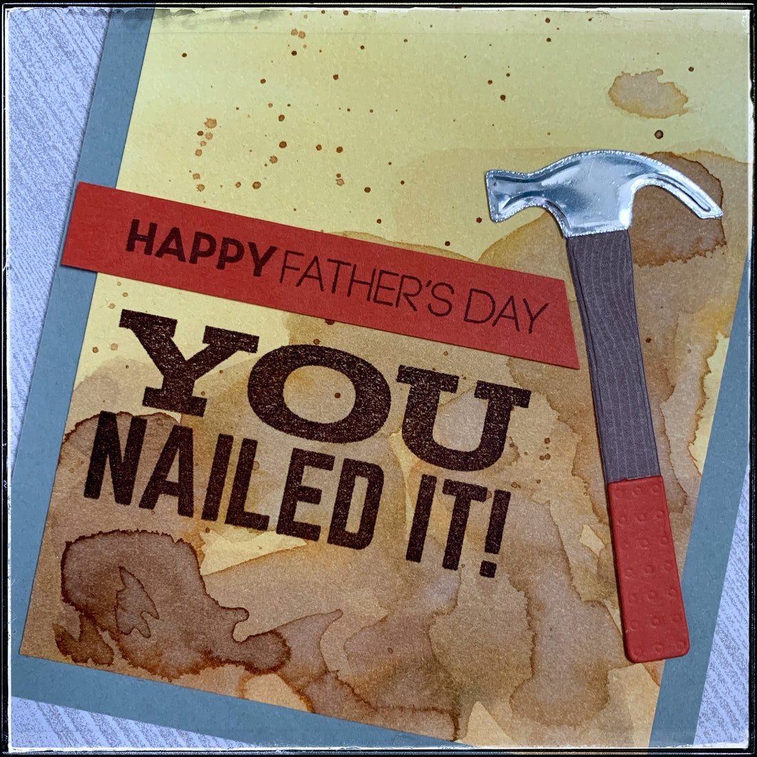
this might be the first card that i've made during this challenge with the color swatch where i haven't used every color of ink. i decided to take a slightly different route and so i began with four shades of brown ink and one olive-greeny ink that was similar to the saffron spice. i used distress inks and i blended them together to create my background panel by watercoloring. each card of the four that i made is slightly different and i love that!
there are at least 5 layers of color on each card. i would lay some color down, heat set it to dry and then go back to paint over with a different color. it's such a fun process and i really need to do it more often. not only is it therapeutic, but it almost always turns out great! so that's how i tied in the bottom three colors from the swatch.

i stamped the sentiment "happy father's day" in dark chocolate ink onto a strip of terracotta tile cardstock that i cut on an angle. beneath it is the secondary sentiment, "you nailed it!" also in the dark chocolate ink. i used one of my new die-cuts to create the hammer. the handle coordinates with the sentiment and the envelope, the body of the hammer features a woodgrain patterned paper, and the head of the hammer is metallic silver and it's one of my favorite details!
the way the swirls and shades of browns combine near the bottom of the card just makes me happy. i flicked some dark brown ink in a splatter pattern and i think it also turned out quite nicely.

both the sentiment [on the strip] and the hammer handle are purposely leaning off of the card panel and i think that they balance eachother out. that card base photographs weird - i think here it looks grey but in real life it's most of a sea green!
father's day is coming up and i don't think that i've ever met a dad that doesn't enjoy tools! this would be great for dropping in the mail or hand delivering to your dad - or any important dad in your life!

after the struggles yesterday, i'm so happy with the way that this card came together. it was so relaxing to paint these backgrounds and i love the way they all turned out, even if they are a little different from one another.
i think this stamp set could lend itself to a little set of cards for any handman/person and i might just have to make that happen! i'll add it to the list, haha!
tomorrow i'll be sharing another edition of #mailitmonday with a special card i'm so excited to share! i hope that you get to enjoy your holiday - stay safe.