march meet the maker : day 25 : how it's made
Share
day 25 : how it's made
i feel like over the last 25 days i've covered a handful of topics that have had something to do with how i go about making cards or my entire process, but today i thought i'd share one of the minor details.
let's pretend that i'm planning on making a thinking of you style card. i'll organize my supplies and trim down my paper or die-cut my shapes. when it comes time to stamp my sentiment i have oodles of choices. sometimes this is the greatest feeling and sometimes this is when i get overwhelmed!

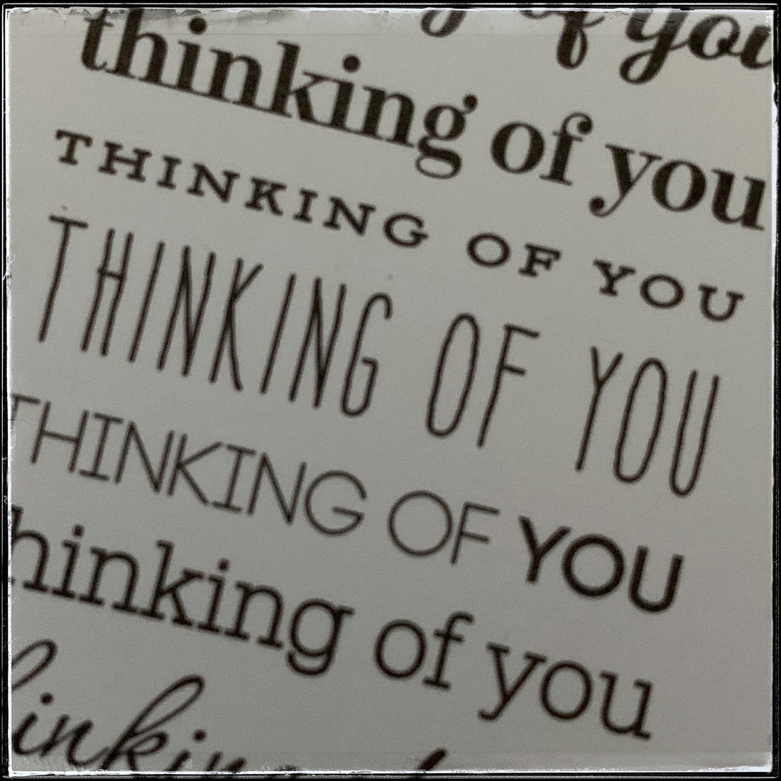
because i have acquired so many stamps over the years, i have a lot that say the same thing in a variety of fonts and styles. to me, i like to pick one that jives with the feel of the entire card. so for example, i'm not going to use a handwritten version on a more formal floral card. i probably won't use a script version on a kid card.
the font plays an important role in the overall feel of the card. papertrey ink [where i get a lot of my supplies from] has these great sets of stamps where the sentiments are the same but there are a variety of fonts. they are some of my very favorite sets because i can use them over and over and each time will have a slightly different feel.
even small choices such as the color of the sentiment can add in a different emotion or feel, as you can see below.


oftentimes i'm an over-thinker and sometimes i can look at a sentiment and know exactly how i want to use it. this is one of the elements of creating that i struggle with - but in a positive way, if that makes sense.
hopefully this has explained a little more in depth part of my process in terms of how my cards are made.
