
march meet the maker : day 23 : photography
day 23 : photography
this is one of my favorite topics of the month, because it's one where i learn so much from other makers!
for a few years i used a wooden slice as the background for my cards when i photographed them. i really liked the natural feel of it and the way the cards were the focal point.


it wasn't until i did the instagram year of color summary that i realized the brown was kind of overtaking everything. being a lover of color, i knew i wanted to change that aspect of my photography.
i looked at some of the feeds of designers & makers i really liked and noted what it was about their photos that stood out to me. most of them had a really clean and bright feel to them. i even reached out to a few of them to ask where they found their backgrounds or what they used. being makers - who are almost always willing to share ideas - they came through! some had wooden panels and a few had scrapbook papers they used as their backgrounds.
so i took to my ginormous stash of scrapbook supplies and found a piece of paper that i really liked and voila! i was off to a great start.
[sidenote] - a few years ago at a pinterest pinners conference in arizona, my girlfriend and i attended a workshop with one of the workers/owners of persnickety prints, [my favorite place to get my photos developed] and we learned about snapseed. it's an app designed for photo editing and i loved the results. not like current snapchat filters, but more like brightness and white balance.
i combined the scrapbook paper with my cards, took a photo from above with my iphone xs max and then did a few simple edits with snapseed. when i'm sharing on instagram i upload my photo to canva so that i can insert it into the collage i've made with the colored background.
today's photo is not of a card, but it's something i finished today and am so excited about!

in about two weeks i'm planning on beginning a project called the 100 day project. you can check out more details here. it's my intention to make a card [or a few of the same design] everyday for 100 days. i think that in order for me to be successful at this, i need to plan ahead.
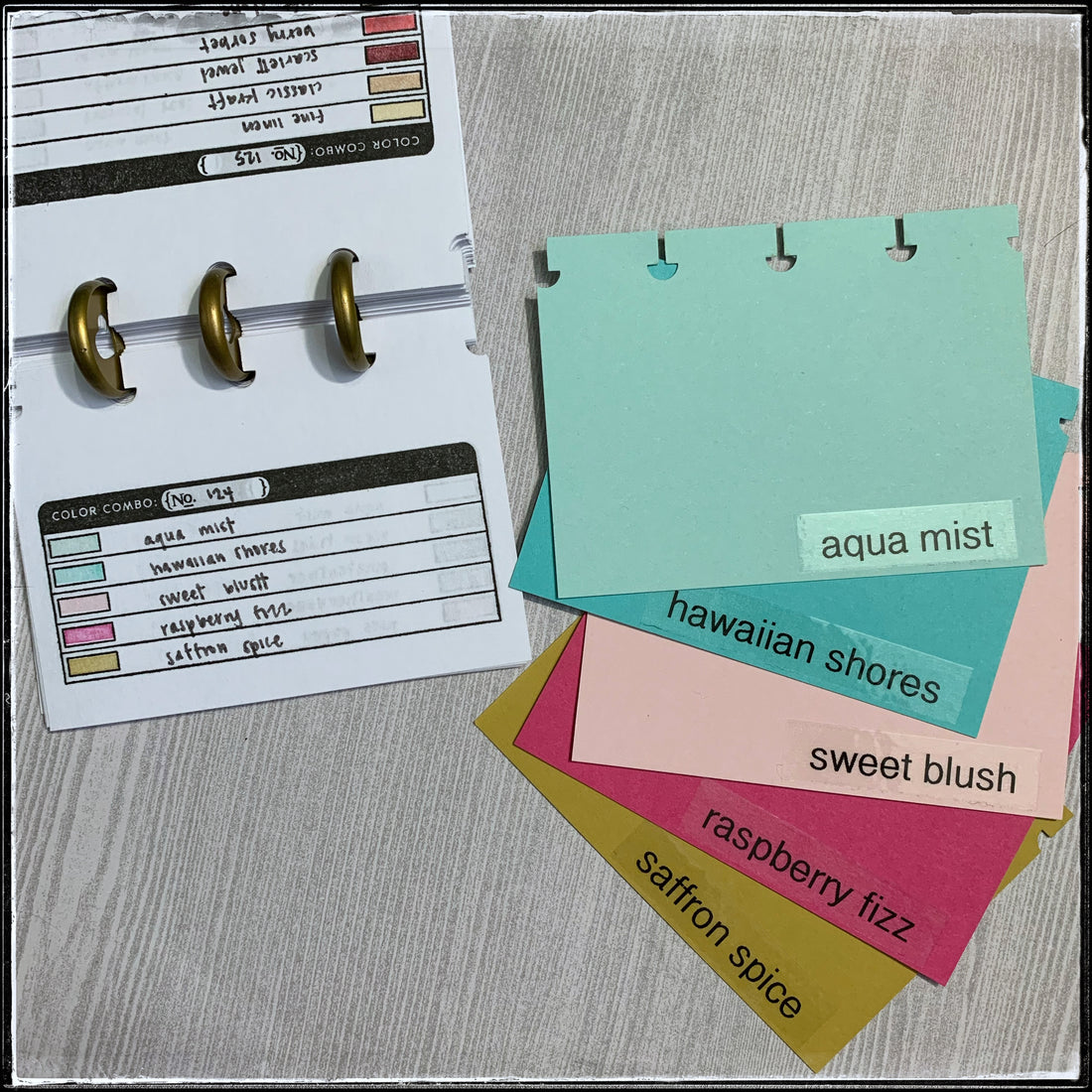
i usually scope out pinterest for a color combination and then take out full sheets of cardstock to figure out what i want to use on the card and which inks i want to use. i decided to make a little guide or book of color combinations with swatches of ink so i can just pick one out and go - eliminating the need to overthink things.
using an older stamp set from papertrey ink, i cut blank 4x6 index cards in half and stamped the color combo guide on both sides. then i wrote down the color combos from pinterest and added in the colors themselves. i punched one side of the paper with my punch from the happy planner and put them on some rings i already had. [i don't love that they're gold, but i also don't see a need to buy new ones when i already have some.] the benefit of putting them on these rings is that i can take them off and on as needed. i stamped 104 combos to get started, but am planning on adding even more.
then i decided to take things one step further! i cut a scrap of each of my colors of cardstock the same size as the ink swatches and punched one side. i used my favorite label maker to put the names of the colors on each one and added them to some additional rings that i had on hand.

now when i pick out a color combination, i can pull the same colors from the ring of cardstock and rearrange them to figure out which colors i want to use and which ink colors i want to use. then i can just stick them back on the ring when i'm done.
i'm super excited about this and am thinking it's really going to help my productivity and keep me even more organized! plus, look how adorable they are up close:

i'm thinking i want to make another little guide with some card sketches on them as well to help with planning, but i'm not sure. i'll keep you updated and of course i'll share photos!
regardless of what i'm photographing, i think the grey background with the subtle pattern really helps my objects stand out. it's always a work in progress when it comes to photography and i'm happy that i have evolved. i really like the look and the feeling that comes with my [card] photos.
what stands out to you? do you love splashes of color or clean lines? do you prefer things to coordinate or do you not care? i enjoy hearing what you look for when you are searching - for ideas, products or pleasure!